By YAN LING TAN
Photo: Unsplash
How we created joyful moments in DBS PayLah!
A series of form fields and lots of bright red buttons. This was the DBS PayLah! app in 2016.
DBS PayLah! in 2016
Did the app work? Fairly well.
Was it useful? Not too bad. Sending money via phone number takes a major pain out of remembering someone’s account number.
How did it make people feel? Nothing much. Sending money was easy with just a few steps on the app.
That was how we felt about the DBS PayLah! app in 2016. Functional, useful and nothing more.
Fast forward to 2018.
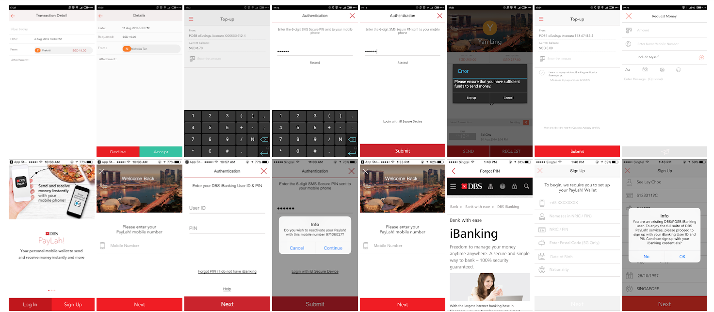
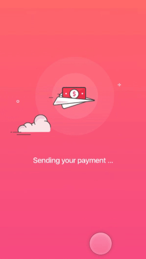
You key in an amount, and a paper plane flies by, with the clouds moving along. Swooshhhhhh!
Then the plane morphs into a big green tick, followed by a loud ‘ding!’. A headline appears, telling me that my money has been sent.
Now, does that sound (a bit) more like a scene from a Pixar movie?
And were you expecting that from a bank’s app?
Probably not.
In 2017, we redesigned the DBS PayLah! app.
Amidst all the re-platforming (one of the key objectives in 2017 was to move PayLah! into a native app) and solving of usability issues, we took the chance to inject joyful moments into the DBS PayLah! app.
One of our key design objectives? — To make payments joyful.
Why the focus on ‘joyful’?
Having money bleed out of one’s account can hardly be considered a positive affair. But who says payments have to be negative and upsetting?
We wanted to change that.
Other than breaking that perception, we also wanted to use joy and emotions to solve a bigger problem — our user retention issues.
Back in 2016, our app’s active usage rate was at a mere 20%. And for every 100 downloads we got, 55 were uninstalled in the same month.
Even though our users were increasing by the day, those numbers were never reflected in our active usage rate.
We seemed to have a problem keeping people around.
Our user research sessions shed some light on the reasons:
Surely, we could work on these issues to increase our retention rate. But as every experienced product manager will tell you, these are longer term issues, and we were not going to solve them overnight.
So as our product and business teams focused on improving the use cases, our UX team focused on the redesign effort. This time round, we focused on the emotions of using the app, hoping to create a memorable payment experience, and turn casual fans (of our app) into fanatics, ready to tell others about their positive experience.
This, we hoped, together with the increase in use cases and solving of our usability issues, would serve as a defending factor against the competition in 2017.
How we made PayLah! joyful
1. Build a sound and solid information architecture
Our first step was to make sure that people could get their jobs done with the app. This took precedence over the emotional cherry, because no product (ever!) would be joyful if people found it hard to use.
In 2016, people came to our app to send and request for payments, pay with a QR code and check their transactions. And as we moved into 2017 and 2018, we had a lot more use cases in the pipeline.
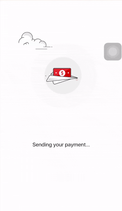
Keeping those in mind, we went on to create prototypes of the app and tested them with users, making sure that what we designed was easy to use.
In an earlier prototype, we explored the idea of having Recent Contacts on the homepage to create a shorter payment flow.
2. Find our personality
After the structure was created, it was time to work on the emotional part.
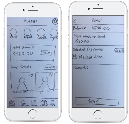
Focusing on emotions meant going back to answer some basic questions — who were we? And what kind of emotional connections did we want to create?
Those questions weren’t easy to answer, but with the help of a card-sorting exercise, we got to it:
We looked at who we are, and who we are not.
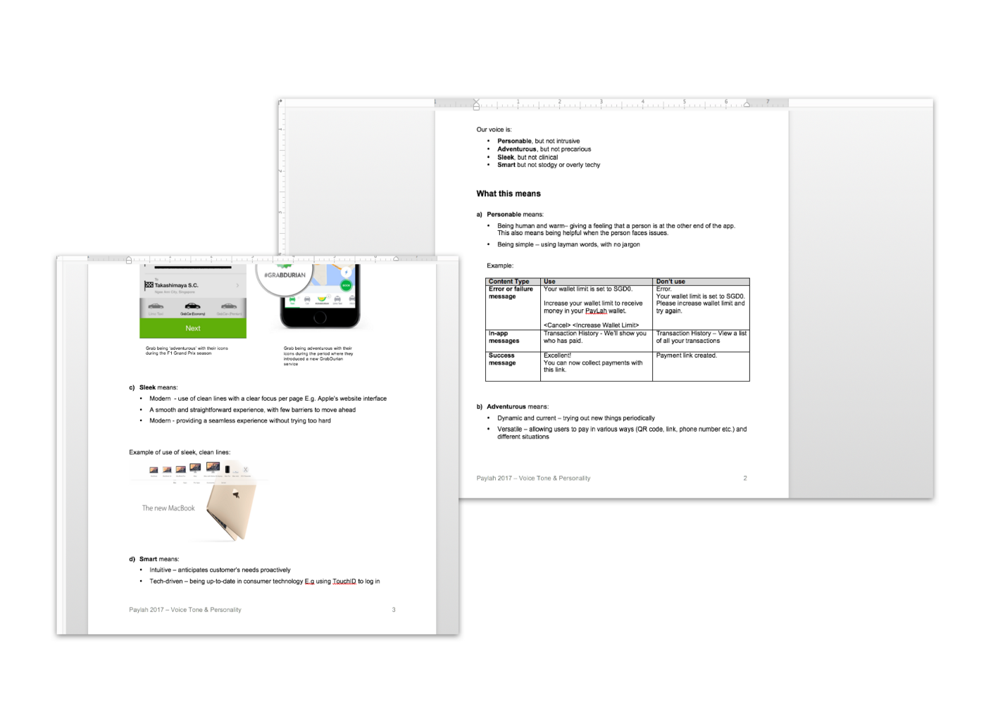
Taking real-life examples like Apple and Grab in mind, we distilled it into a Voice, Tone & Personality guide, which steered our visual and copy creation process.
A Voice, Tone and Personality guide was created to guide our visuals and copy.
3. Create the key moments
Then we got to the fun part — designing our personality.
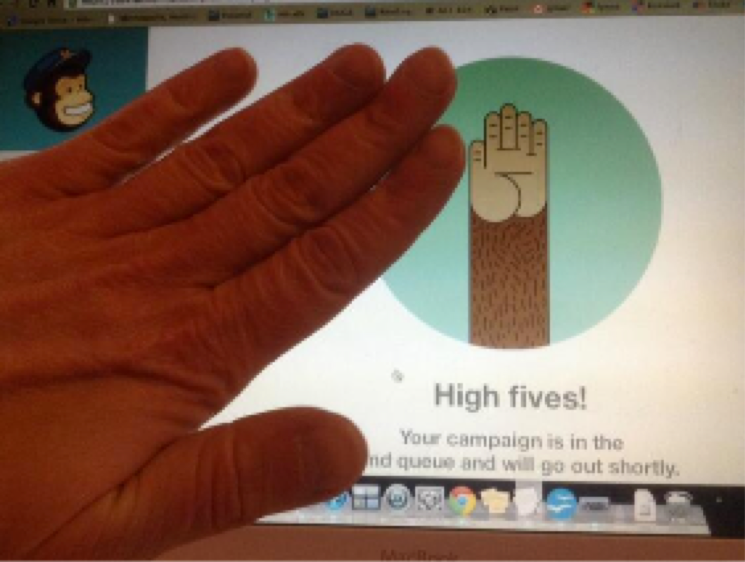
One of our key inspirations was the Mailchimp app, a tool used to create email campaigns. They were known for making the last few moments of setting up an email campaign fun and memorable.
When you’re ready to hit the send button, you get a little sweaty monkey hand hovering over a big red button.
And once you send, you get a little monkey-paw high-five. Woot.
In fact, it was so impactful that people actually reached into the screen to do a high-five!
This ‘high-five’ with the success screen went viral online and created much interest for Mailchimp.
And just like how Mailchimp created a signature moment out of the “high-five”, we wanted to create one for PayLah!.
***
Chip and Dan Heath — authors of The Power of Moments — shared that one of the best ways to create a memorable and emotional experience is to create peak moments. We can do that by turning up the volume of an experience orbreaking the script.
In the case of Mailchimp, they had turned up the volume of an anxiety-filled-campaign-sending-experience with a sweaty monkey hand. And when the campaign is out, they had broke the script by rewarding the user with a high-five.
For PayLah!, we saw the peak moments in the last 2 screens of the Pay and Request flow. To create the ‘adventurous and sleek’ feeling, we explored a series of metaphors — flying aeroplanes, rockets and whatnots.
Our inspirations to create the feeling of adventure
Then we explored different types of copy as part of the concept:
After some experimentation, we finalised on a paper plane carrying cash for the Payment flow.
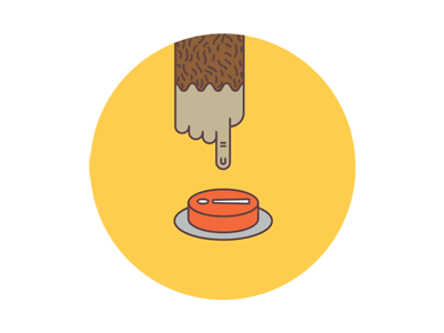
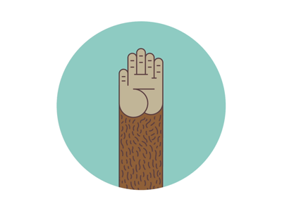
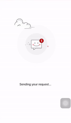
For the Request Money flow, we broke the script by using a flying smiley, taking a dig at the sheepish expressions people usually make when asking for funds.
Our friendly ‘owe money pay money’ expression :)
And to anchor the look, we selected a vibrant pink (we call it dragonfruit pink) as the colour theme for the app, breaking out of the usual red and black for DBS’ apps. We wanted our app to feel fresh and trendy, and be something our millennial audiences identified with.
We used a bright ‘dragonfruit pink’ to anchor the overall experience.
4. Executing and iterating on the moments
With a solid concept in mind, we strung it all together, keeping in mind the user’s emotions at each point. And to amplify the experience, we employed the use of sound.
“Whoooshh!” The plane would fly by, as a user makes a payment.
By then, everything looked set for execution.
However, executing the concept wasn’t as smooth as we thought.
After seeing it come together in a prototype, it became apparent that too much was happening in just one screen — an aeroplane was flying by with a “whoosh” sound, and in that split second, the copy was trying to say something.
This prompted us to scale back on the copy so we could let the visuals and micro-animation shine.
To us, refining and iterating was about figuring out the star of that moment.
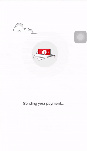
We also scaled back on the ‘dragonfruit pink’ after sharing it with our stakeholders, realising that it was a little too jarring alongside DBS’ other brand assets.
Our initial version, where the colour pink was used to anchor the app.
A stripped down version that we finally went out with.
Post-Launch
After the launch, it was nice to hear that people remembered the new experience.
“You guys really pushed the boundaries on what a bank app could be. It is not stiff and rigid. I remember the flying airplane. ” — Yusuf, DBS staff
“New DBS PayLah! design is fresh and refreshing, but interactions still lacking polish.” — Mike, Senior Product Designer
Right. We could do better.
But what surprised me most was the impact we had on DBS’ staff. We managed to push the envelope on what a payments app — or a bank app — could be, from within. We showed that a payments app from a bank, need not be boring or rigid.
Key Takeaways from the Journey
Now that the redesign has been done and dusted for a year, here are my key takeaways on our journey from conceptualisation, design and all the way to development:
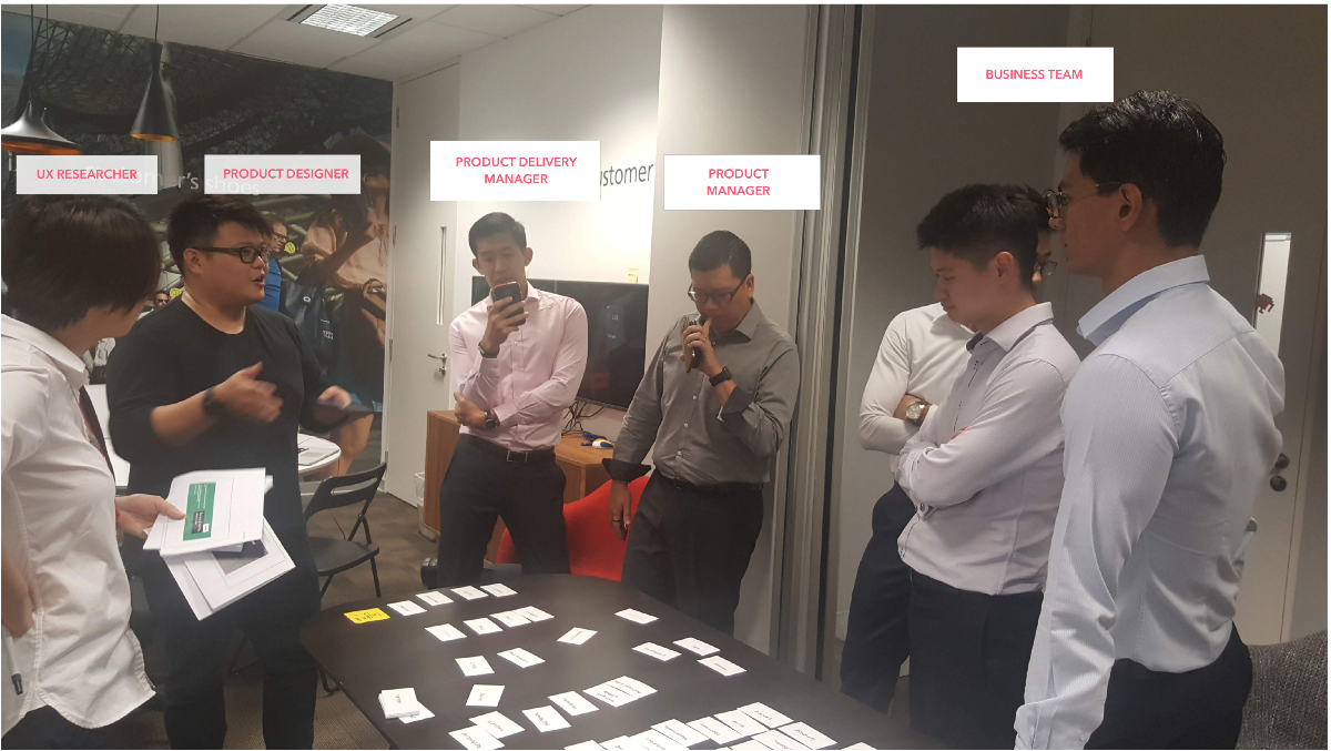
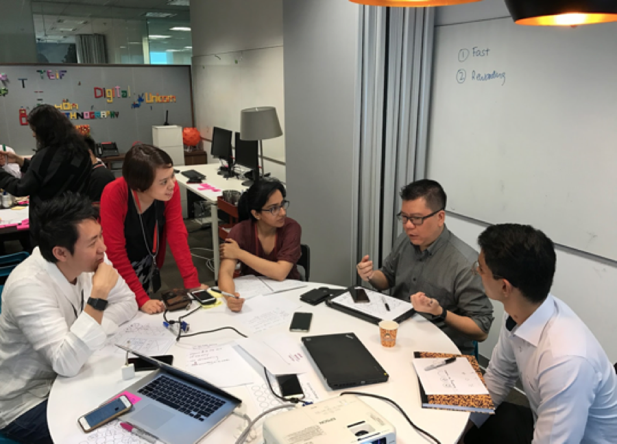
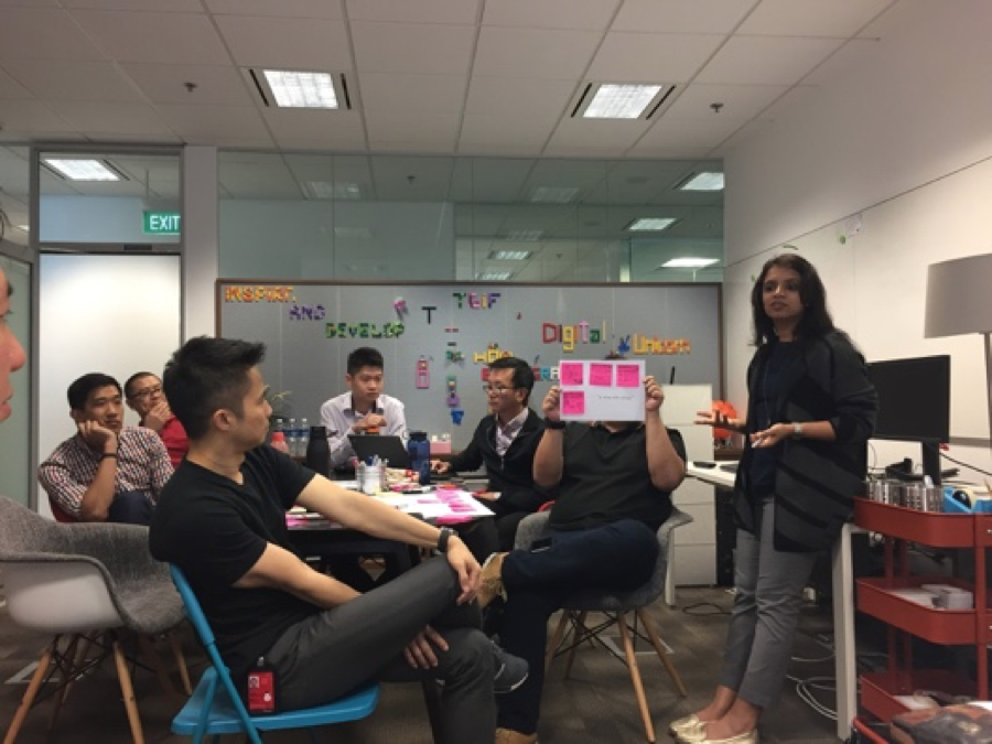
#1: Align fast, and early on. — Getting everyone aligned on the same vision, objectives and problems to be solved was important, especially in a big organisation like DBS with multiple stakeholders.
How did we do it? We got everyone who had a say in PayLah’s future direction to define how we could create these few key moments, together. This helped us put everyone on the same page and ready for the upcoming journey.
Kevin, our product manager sharing how we could use PayLah! at the hawkers
Prakriti, our UX research lead facilitating the workshop
#2: Use the 80/20 rule and focus on a few key areas — With a short timeline of four months where we had to redesign the app from the ground up, it was important to focus on the parts that would have the most impact on user experience — or the 20% that accounted for 80% of the PayLah! experience. In our view, it was the information architecture and those 2–3 defining moments. Issues like the lack of use-cases required more time to resolve and could wait, for now.
Identifying these 20% areas early on and securing the team’s buy-in kept us focused on what we needed to accomplish, instead of chasing every good idea that popped up.
#3: A lean and competent team matters! — Even though the redesign project was largely visual, we decided to revamp all the in-app microcopy and error messages halfway through the project to be in line with the new personality. Rabnick, our delivery manager rushed to identify all the in-app scenarios so we could review and re-write some of the messages in the weekend.
As we pushed through the project, Kevin and Debbie, our product manager and delivery lead even buckled down to make sure our microcopy matched the design build delivered by the technology team. They showed me the true meaning of TEAM!
Our work is not done; and we can’t wait to show you what else we have in store!
For now, it’s a big thank you to the PayLah! product and business team in 2017. Thanks for joining the UX team to bring the new PayLah! to life - Kevin, Gene, Debbie, Rabnick, Samuel, David, Giap Seng and Andrew.
And to our UX team behind the concept, visuals, customer journey and flying gifs — Nicholas, Grace, Resse, Chooake and Prakriti, it was an awesome journey!
Yan Ling is a user experience researcher in the DBS Bank’s User Experience & Design team. Besides championing user’s needs, she also enjoys creating experiences through visuals, words, aromas and food. A productivity geek at heart, she can talk all day about her love for Tim Ferris, Shawn Blanc and James Clear’s work.
This story was first published on DBS Design – Stories from the design team at DBS Bank in Singapore.
Asia’s Safest Bank, 2009 – 2024, Global Finance
Best Bank in the World 2022, Global Finance
World's Best Bank 2021, Euromoney
Best Bank in the World 2020, Global Finance
World's Best Bank 2019, Euromoney
Global Bank of the Year 2018, The Banker